Visuals for Riversol's Canada Day and Fourth of July Campaign
Designed a range of visual assets for Riversol's digital design efforts, including social media graphics, web banners for ecommerce maintenance, banner ads, email templates, and still photography. The campaign promoted Canada Day and Fourth of July specials, focusing on Riversol's new product line with engaging, eye-catching designs that aligned with the brand’s aesthetic and messaging.
Process for Creating Visuals for Riversol’s Digital Marketing Campaign
Step 1 - Existing Photos: First, I took a look at Riversol’s visual library. While we had great images of models, there were no product photos available that fit our needs.
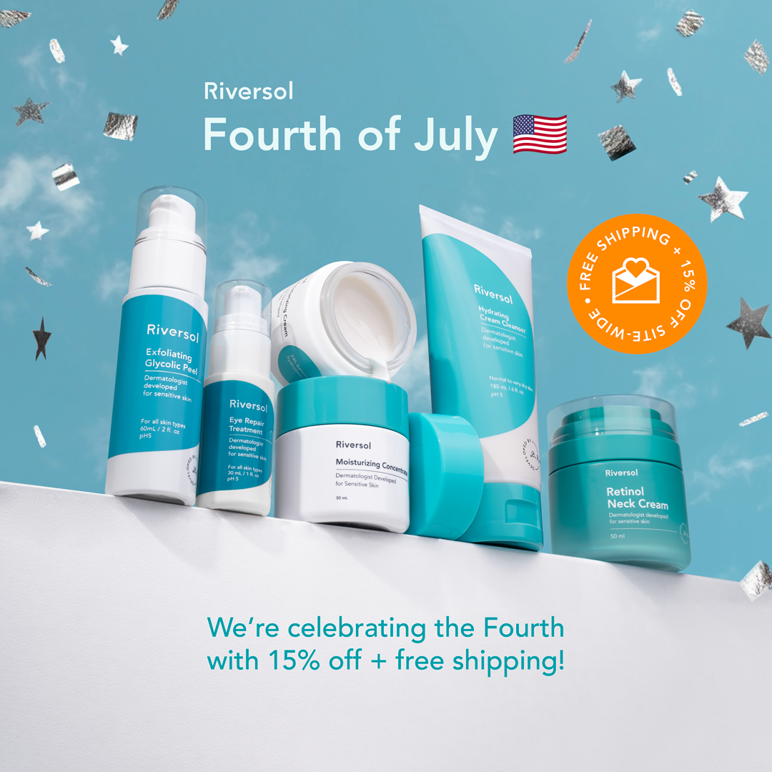
Step 2 - New Photography: To solve this, I took new photos of the products myself. I used a unique contra-plonge angle to make the products stand out, giving them a hero-like presence that’s a bit different from the usual brand shots.
Step 3 - Editing: After the photoshoot, I edited the images using Photoshop to make them look their best and ready for the campaign.
Step 4 - Organizing: I carefully organized all the files, folders, and layers in Photoshop, so it’s easy for anyone on my team to pick up and use them. This keeps everything neat and efficient.
Step 5 - Designing: I then applied Riversol’s brand guidelines and my design skills to create layouts that really shine. This involved using brand colors and typography to ensure everything fit perfectly with the campaign’s look and feel.
Step 6 - Adapting for Formats: Finally, I made sure the designs worked across various sizes and formats, so they’d look great no matter where they’re used, from social media to email marketing.
- Company: Riversol
- Launch: July/2024.
- Audience: Canada and USA
Maintaining Campaign Identity with Flag-Inspired Elements
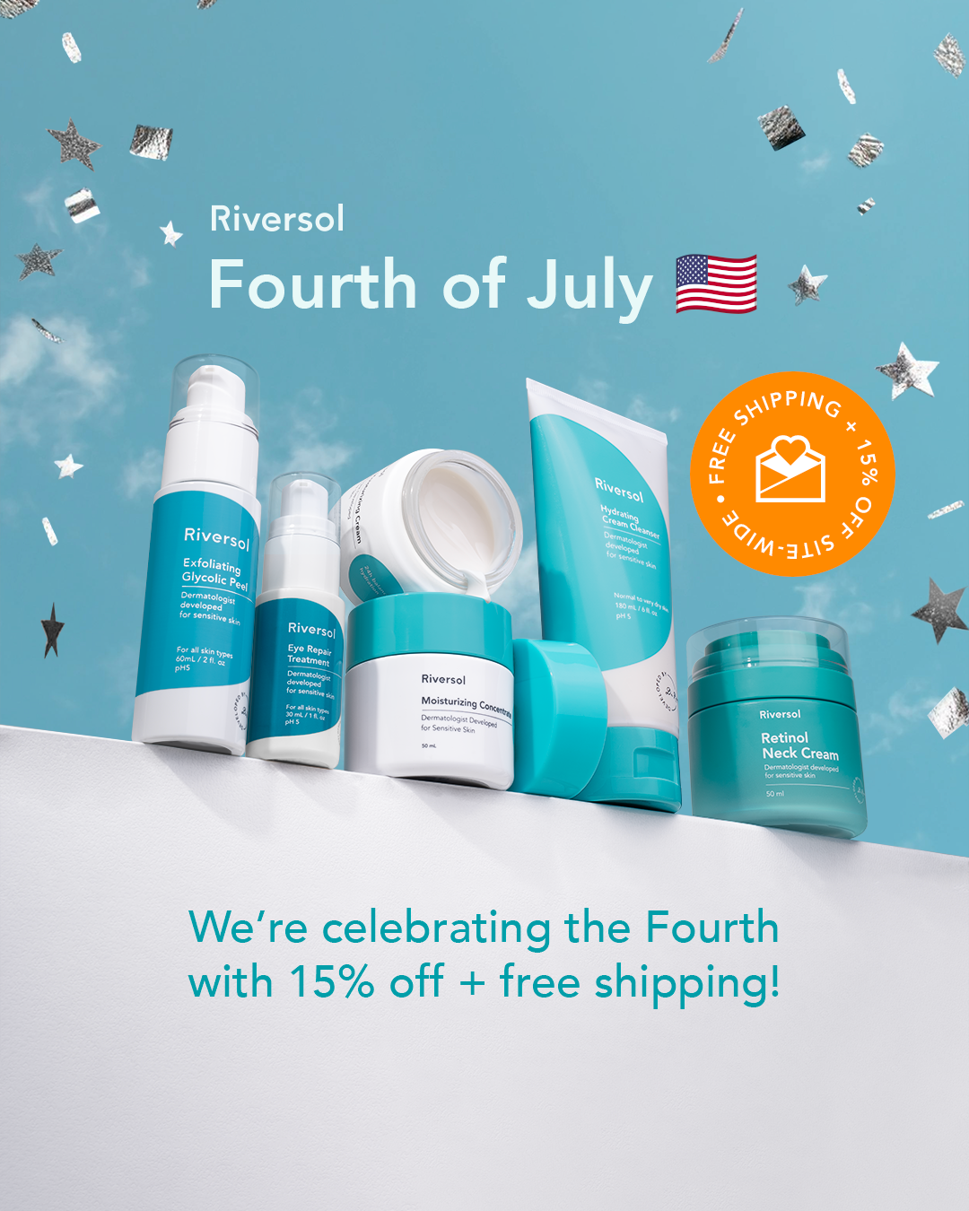
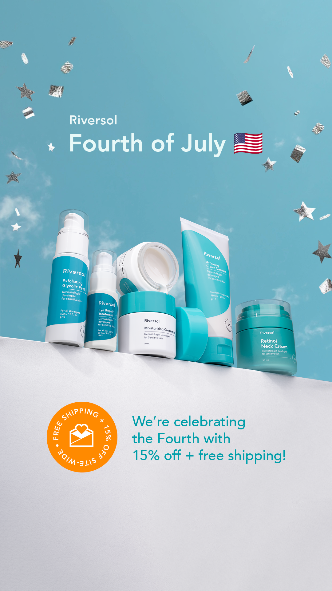
To maintain the identity of the campaign, I kept the background colours and most of the elements to save time. Since these are national holidays, I drew inspiration from both flags. For Canada Day, I stylized the confetti in the shape of maple leaves, and for the USA, I incorporated stars from the flag.
Static Ads adapted for multiple sizes
Adapted the visual campaign for email headers, creating animated GIFs.
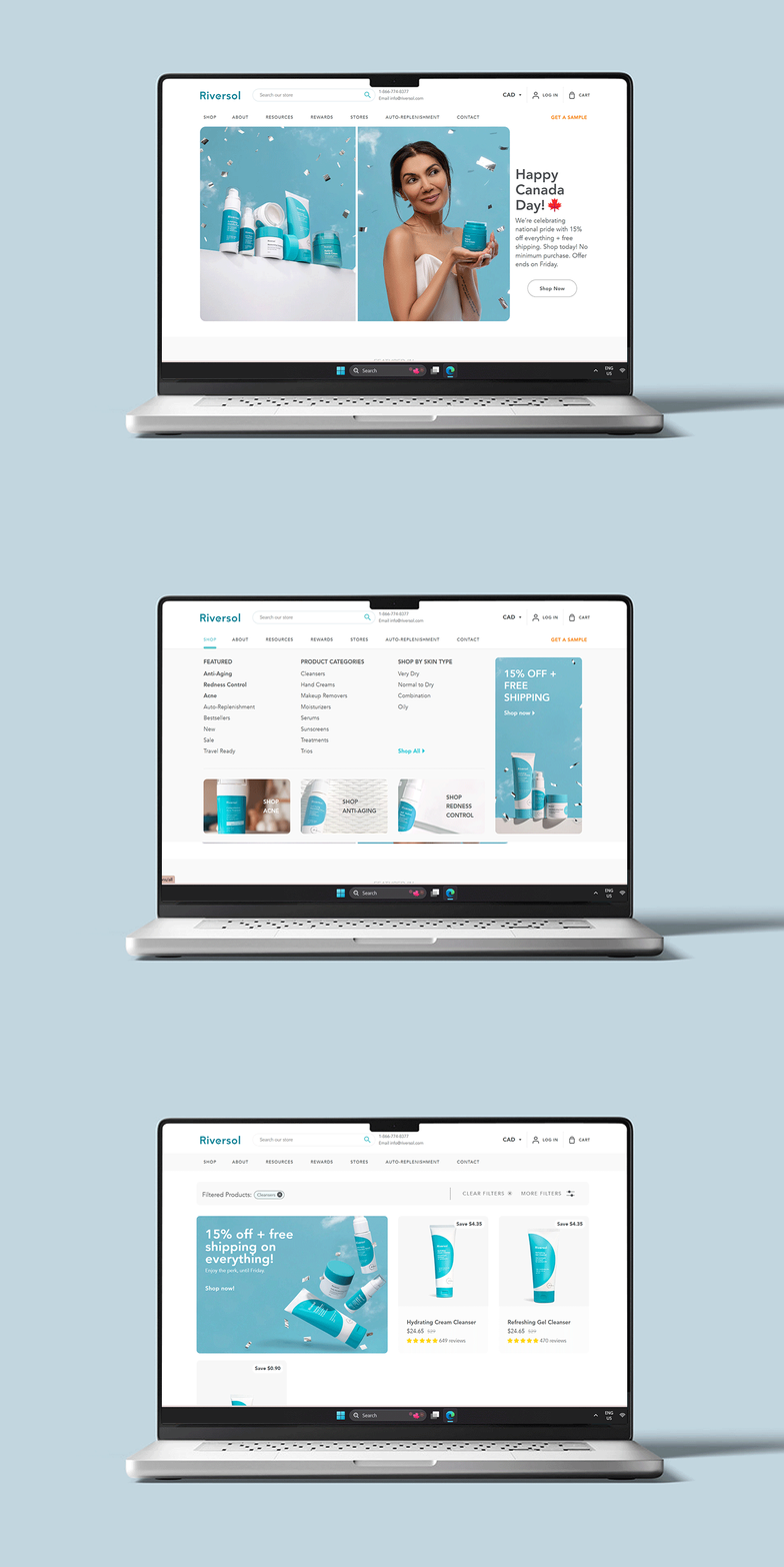
Web Banners for E-Commerce Maintenance
Designed and developed web banners specifically for e-commerce maintenance, ensuring they were visually appealing and aligned with the brand’s aesthetic. These banners were crafted to be dynamic and responsive, accommodating various screen sizes and enhancing the user experience across different devices. The goal was to maintain consistent visual identity and effective messaging throughout the online store, contributing to a cohesive and engaging shopping experience.


